Importance of Data Visualization In Analytics | Data Visualization Help Using Python and R
- realcode4you
- Feb 18, 2023
- 2 min read
Data visualization refers to representing data in a visual context, like a chart or a map, to help people understand the significance of data by placing it in a visual context.
Data Visualization is a Business Analytics tool for data based decision making.

Data visualization is the use of visual representations to explore, make sense of, and communicate data
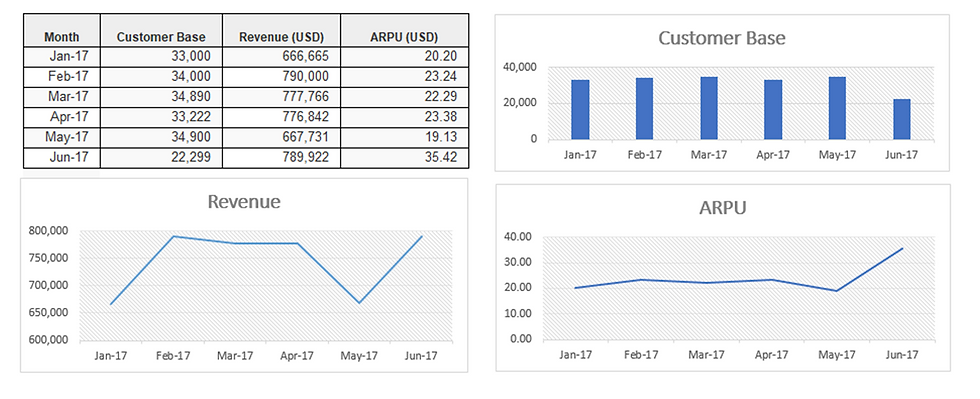
Example 1:(Interpret below table)

Visualize the Result:
Expressing Quantitative Data Visually
Vision is by far our dominant sense
Data visualization helps process data faster – “picture superiority effect”
Some quantitative tasks can be best performed, when values are displayed graphically
What visual perception evolved to do especially well, it can do faster and better than the conscious thinking parts of our brains
Data exploration, sensemaking, and communication should always involve an intimate collaboration between seeing and thinking (i.e., visual thinking)
Seeing the big picture
Easily and rapidly comparing values
Seeing and comparing patterns
Myths
We visualize data because some people are visual learners
We visualize data for people who have difficulty understanding numbers
We visualize data to grab people’s attention with eye-catching but inevitably less informative displays
The best data visualizers are those who have been trained in graphic arts
Graphics provide the best means of telling stories contained in data
BI Vs Data Visualization
BI
◉ Tools and techniques used to transform raw into data for analysis
Data Visualization
◉ A visual representation of data for use in decision making
Evolution of Data Visualization
We don’t have a comprehensive history of data visualization
Michael Friendly and Daniel J Denis of York University attempted to provide a comprehensive history of visualization
Mankind used visualizations to instruct, convey meaning and tell stories since the dawn of time
Archaeologists find 12,000-year-old pictograph at Gobeklitepe in Turkey
Documented data visualization can be tracked back to 1160 B.C. with Turin Papyrus Map
Invention of paper and parchment allowed further development of visualizations throughout history
Statistical graphs used in presentation between from 18th Century
Progression of technology enhanced interactive designs with computer based visualization

Konya town map – world oldest known map – 6200 BC

Mercator 1569 world map

Minard's graphic of Napoleon in Russia
Poor Visuals


You can see issue at 2016-2017
Visualization Using Python


Realcode4you is the top rated online programming and project help service provider. We are group of highly skills Data Science and Machine Learning experts that has advance knowledge in all Data analysis and data visualization.
For more details you can contact us or send your project requirement details at:
realcode4you@gmail.com


Comments