Data Visualization Using Plotly | Choropleth COVID-19 Project
- realcode4you
- Jun 6, 2021
- 2 min read

Requirement:
Successfully load data to dataframe without downloading the data
Successfully process data including additional columns, calculations, transformations
Produce animated plot of case moving average
Produce static plot of cumulative cases per 100,000
Code does not crash
Objectives:
Create an animated choropleth plot using plotly that analyzes a seven-day moving average of cases for some geographic unit and sub-unit (e.g. USA and states)
Create a second, non-animated, choropleth plot that shows cumulative cases per 100,000 people for the most recent date in the data file.
Requirements:
Find appropriate data source that includes new COVID-19 cases per day for the geographic region. (Direct link not downloaded file.)
Find a data source that estimates the population for the geographic region. (Direct link not downloaded file)
Load both to a pandas dataframe
Calculate cumulative cases per 100,000 population for the sub-region (i.e., state)
Calculate 7-day moving average if new cases
Plot 7-day moving average of cases on Plotly plot and animate by day (older dates on left of slider)
Create a separate plot of cumulative cases per 100,000 population. This should be for the maximum date in the dataframe and should not be animated.
Plots will include relevant title and hover text.
Colors will be continous scale of your choice.
Install the libraries
!pip install -U plotlyLoad the Dataset
!git clone https://github.com/nytimes/covid-19-data.gitimport pandas as pd
import plotly.express as px
#Visualizations on US Map
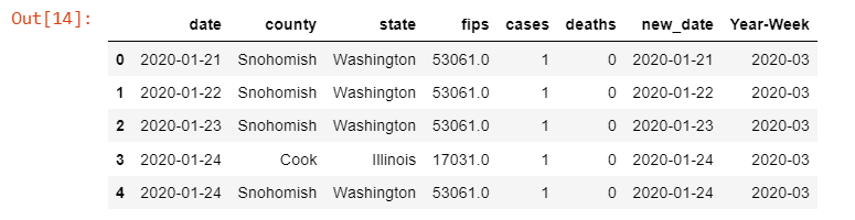
df_us = pd.read_csv('covid-19-data/us-counties.csv')
df_us['new_date'] = pd.to_datetime(df_us['date'])
df_us['Year-Week'] = df_us['new_date'].dt.strftime('%Y-%U')
df_us.head()Output:
us100k = df_usShape of dataset
df_us = df_us.iloc[:1000,:]
df_us.shape
Output:
(1000, 8)Short And Group By
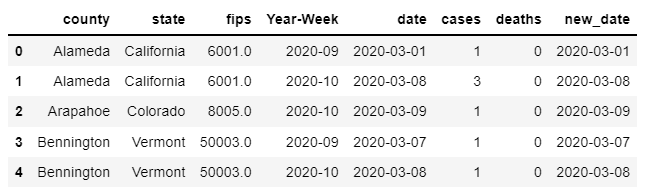
df_us = df_us.sort_values(by=['county', 'state', 'new_date'])
df_us_week = df_us.groupby(['county', 'state', 'fips', 'Year-Week']).first().reset_index()
df_us_week
df_us_week.head()
Output
Count the cases
df_us_week['cases'].max(), df_us_week['cases'].min()Output
(91, 1)Load Json data
from urllib.request import urlopen
import json
with urlopen('https://raw.githubusercontent.com/plotly/datasets/master/geojson-counties-fips.json') as response:
    counties = json.load(response)

counties["features"][100]
Output:
{'geometry': {'coordinates': [[[-113.931799, 42.535275],
[-113.932904, 42.765032],
[-113.763862, 42.764508],
[-113.713928, 42.849733],
[-113.714701, 43.20003],
[-113.413693, 43.199785],
[-113.413026, 42.84925],
[-113.472155, 42.849218],
[-113.472177, 42.669251],
[-113.557609, 42.656416],
[-113.655338, 42.535663],
[-113.779811, 42.55687],
[-113.931799, 42.535275]]],
'type': 'Polygon'},
'id': '16067',
'properties': {'CENSUSAREA': 757.591,
'COUNTY': '067',
'GEO_ID': '0500000US16067',
'LSAD': 'County',
'NAME': 'Minidoka',
'STATE': '16'},
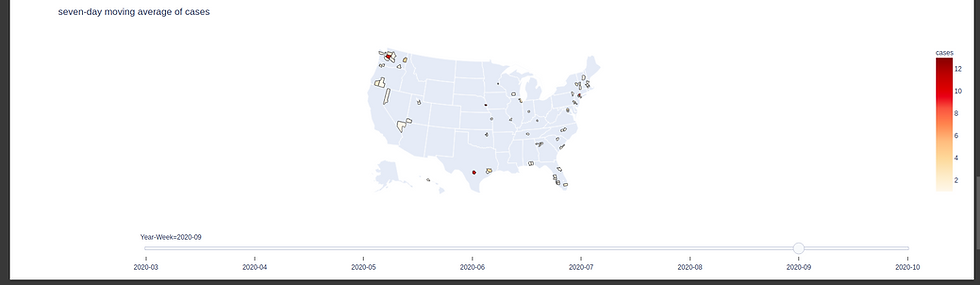
'type': 'Feature'}Create an animated choropleth plot using plotly that analyzes a seven-day moving average of cases for some geographic unit and sub-unit (e.g. USA and states)
df_us_week = df_us_week.sort_values(by=['Year-Week'])
fig = px.choropleth(df_us_week, geojson=counties, locations='fips', color='cases',
                           color_continuous_scale=px.colors.sequential.OrRd,
                           title = "seven-day moving average of cases",
                           scope="usa",
                           animation_frame="Year-Week",
                          )
fig["layout"].pop("updatemenus")
fig.show()
Output:
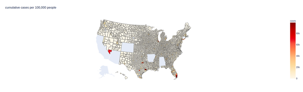
Create a second, non-animated, choropleth plot that shows cumulative cases per 100,000 people for the most recent date in the data file.
us100k=us100k.loc[us100k['cases'] <= 100000]
fig = px.choropleth(us100k, geojson=counties, locations='fips', color='cases',
                           color_continuous_scale=px.colors.sequential.OrRd,
                           title = "cumulative cases per 100,000 people",
                           scope="usa",

                          )
fig["layout"].pop("updatemenus")
fig.show()
Output


Comments