Data Analytics Using ABC Pharma Data | Data Analytics Assignment and Project Help | Realcode4you
- realcode4you
- Jan 30, 2024
- 3 min read
ABC Pharma is an Indian company that produces nutritional products and branded generic pharmaceuticals. They have been in the market for more than 2 decades and have been able to differentiate their offerings from other competitive brands. This allows them to enjoy an excellent margin on the products that they sell. Their customer base consists of people lying in the top of the economic pyramid across all states in India. Though they have seen a 5% year on year growth over the past few years, the top management is concerned that the other nutrition and pharmaceutical companies have registered a growth of more than 8% in the recent years. The management wants it marketing officer to look at the various advertisement channels and its effectiveness by evaluating their recent financial performance data.
The dataset consists of the following variables for each state in India for the year 2021. Note that the company sells its products through online as well as in-store channels.
Variables
State Name
Online Channel Costs
In-store Channel
Costs
Cost of Digital Ads
Cost of Print Ads
Cost of TV Ads
Cost of In-store Ads
Online Revenue
In-store Revenue
Total Revenue
Profit
Can you draw insights from this dataset and suggest action items to the management of ABC Pharma?
!pip install openpyxl#importing libraries
import numpy as np
import pandas as pd
import seaborn as sns
import matplotlib.pyplot as pltdf.head() #checking first 5 rows of the dataframeoutput:

output:
(31, 11)output:
<class 'pandas.core.frame.DataFrame'>
Int64Index: 31 entries, 0 to 30
Data columns (total 11 columns):
 #   Column                  Non-Null Count  Dtype
---  ------                  --------------  -----
 0   State                   31 non-null     object
 1   Online Channel Costs    31 non-null     float64
 2   In-store Channel Costs  31 non-null     float64
 3   Digital Ads             31 non-null     float64
 4   Print Ads               31 non-null     float64
 5   TV Ads                  31 non-null     float64
 6   In-store Ads            31 non-null     float64
 7   Online Revenue          31 non-null     float64
 8   In-store Revenue        31 non-null     float64
 9   Total Revenue           31 non-null     float64
 10  Profit                  31 non-null     float64
dtypes: float64(10), object(1)
memory usage: 2.9+ KB
df.columns #column names of the datasetoutput:
Index(['State', 'Online Channel Costs', 'In-store Channel Costs',
       'Digital Ads', 'Print Ads', 'TV Ads', 'In-store Ads', 'Online Revenue',
       'In-store Revenue', 'Total Revenue', 'Profit'],
      dtype='object')
df.describe() #getting general info mean, std deviation, min, maxoutput:

#takes a numerical feature and plots it against the feature State
def print_state_wise(x):
    temp = df.sort_values(by=x)
    plt.figure(figsize=(10, 14))
    sns.barplot(y = "State", x = x, data = temp)
    plt.show()
    print("State with minimum", x, "is", temp.iloc[0]["State"])
print("State with maximum", x, "is", temp.iloc[-1]["State"])print_state_wise("Profit")output:

State with minimum Profit is Sikkim
State with maximum Profit is Maharashtra
print_state_wise("Digital Ads")
State with minimum Digital Ads is Sikkim
State with maximum Digital Ads is Maharashtra
print_state_wise("Print Ads")output:

State with minimum Print Ads is Tripura
State with maximum Print Ads is Maharashtra
sns.pairplot(df) output:

Above we tried to see if there is any correlation and we find that most of them are highly correlated to each other, so we will now see exact numbers to figure out which features on change will give better results in terms of Profit and Revenue
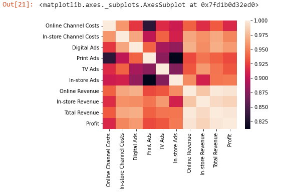
corr = df.corr().abs() #getting correlation between different featuresdesired_correlation_comparision_features = ['Digital Ads', 'In-store Channel Costs', 'In-store Ads',
'Online Channel Costs', 'TV Ads', 'Print Ads']plt.ylim(0.9, 1) #limits y labels from 0.9 to 1
corr["Profit"][desired_correlation_comparision_features].sort_values(ascending=False).plot.bar()
#here we are plotting correlation of Profit with other features in the list desired_correlation_comparision_featuresOutput:

For the profits increase we see that more spending in In-store Channel Costs is better than Online Channel Costs. As well as Digital Ads Cost increment could lead to better Profit as compared to Print Ads
plt.ylim(0.9, 1)
corr["In-store Revenue"][desired_correlation_comparision_features].sort_values(ascending=False).plot.bar()
#here we are plotting correlation of In-store Revenue with other features in the list desired_correlation_comparision_features
output:

To increase the In-store Revenue, we see that more spending in In-store Channel Costs is better than Online Channel Costs. As well as TV Ads Cost increment could lead to better In-store Revenue as compared to In-store Ads
plt.ylim(0.9, 1)
corr["Online Revenue"][desired_correlation_comparision_features].sort_values(ascending=False).plot.bar()
#here we are plotting correlation of Online Revenue with other features in the list desired_correlation_comparision_features
output:

To increase the Online Revenue, we see that Digital Ads Cost increment could lead to far better Online Revenue as compared to Print or TV Ads
sns.heatmap(corr) # this is further pictured correlation output:


Comments